Dan's Papers Cover Artist Grant Haffner Paints Montauk
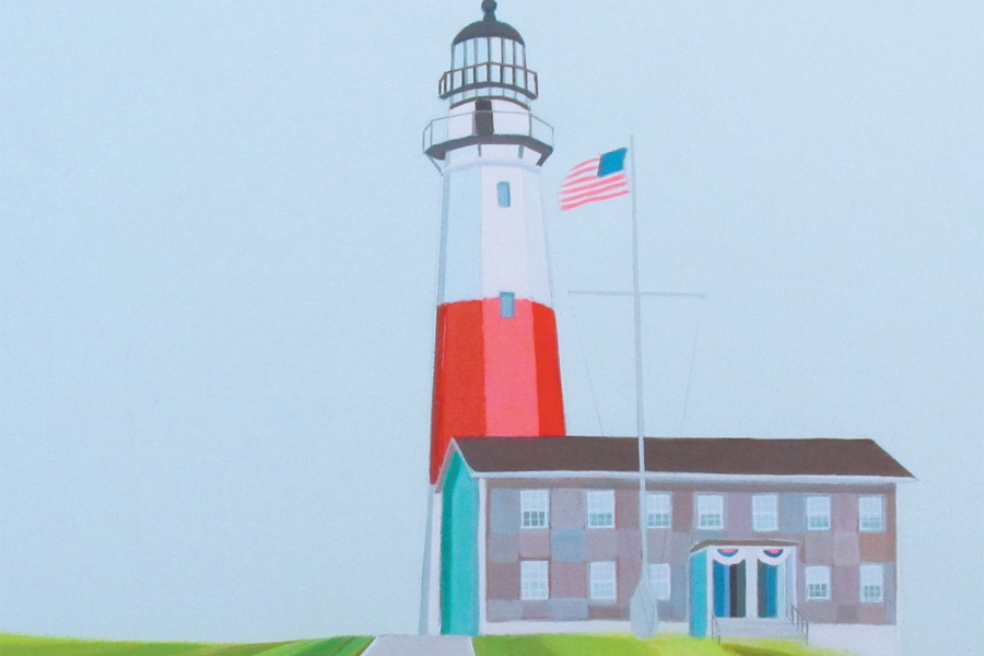
Painted in East End artist Grant Haffner’s distinctive style, this week’s cover depicts the iconic Montauk Point Lighthouse. Haffner is dedicated to capturing and paying homage to his local surroundings, those that he has witnessed changing drastically. The third-time Dan’s Papers cover artist lets us in on what his work is all about.
Your work is seen often—you must be busy.
I am, and now as a new dad with a 3-month-old baby girl, Pheonix, and a 2-year-old son, Griffin, I’m spending most of my day with them and then painting at night. I’m getting a lot of interest in my work now, which has been great.
My first show was in 2005 at Ashawagh Hall [in Springs] but more recently I’ve been using social media, which has opened up a lot of doors globally. It’s huge what it’s doing for my career. Last year, one of my images appeared in the background of a Hamptons garden magazine. It was nice to know that the work is appreciated.
How did you discover this motif of utility poles with power lines?
Well, the initial idea was one I had while at SVA [School of Visual Arts]. I wanted to paint landscapes and had this desire to paint the landscape of my home. I also had this fascination with stripes and lines, even my clothes were striped, so I had the idea to break the landscape into all lines. When you visit the museums, you realize the contemporary artists all have a style. I wanted to develop a style, deconstructing what I saw into lines—it had the benefit of creating movement and I can use those lines to direct your eye down the road.
Another idea I had was defining what’s my landscape. I was a landscaper by trade, and had spent 12 years working outdoors. America has a love for car culture, driving, and I was also obsessed with Kerouac, road trips…it really all came together that the open road was a great landscape metaphor. Because you drive so much, you go down 27 so many times, the power lines are iconic and ingrained in your memory.
Now, having been here since the 80s, I can see how it’s changed over the years. I feel like it’s my life goal to paint this area before it changes too much. That’s where some of these more iconic things like the lighthouse come in.
Do you paint from memory? What is your process like?
I paint from photographs. So I go out and I try to capture. I do change the color schemes completely, if I want it to be a sunset, I can create the time of day I want. The photo is just the architecture. The lighthouse is very specific to the perspective, but it wasn’t a clear day. The photograph is mostly for the composition.
What guides your choice of color schemes in your paintings?
My emotional reactions to the scenes change at different time of year. Recently, I did a winter scene and it was all very grey. It’s all very spontaneous. For the Montauk one, the background in light blue dictated the whole thing. I enjoy very bright colors, so I try to sneak them in. A lot of layering happens. I use acrylic, mixed media, pencil and marker, and, sometimes, fluorescent paint. Because I paint on wood panel, I can do some sanding effects, where I can sand things off if I don’t like it. It adds an element of abstraction. I play a fine line between doing things very abstract, and build it up to be very illustrative.
Who are some of the artists you admire?
My favorite artist of all time is Wayne Thiebaud. You know the cake paintings and ice cream cones, but he does some landscape paintings that are just breathtaking. That’s what pushed me into my style. Currently, also Jules de Balencourt and the Canadian artist Kim Dorland.
For more information about the artist, visit granthaffner.com. This issue’s cover painting, “The End,” is available locally through Damien Roman Fine Art, damienromanfineart.com.

