Barclays says NY Islanders Will Not Become Brooklyn Hockey
Last month, the Barclays Center filed an application to trademark the name and logo “Brooklyn Hockey.” It consists of crossed hockey sticks above a puck inside a circle.
Because this fall the New York Islanders hockey team is moving to Brooklyn to play at the Barclays Center, people wonder if the name of that hockey team, the only major professional sports team in Nassau or Suffolk, is going to be changed to “Brooklyn Hockey.”
Not so, said Barry Baum, executive vice president and chief communications officer for Barclays Center. Barclays has platforms for various second-tier programs at the Center. They’ve trademarked Brooklyn Hoops, Brooklyn Boxing and Brooklyn Show. Now they will have second tier programs of college hockey and amateur hockey at the center. This has nothing to do with the Islanders coming. They will be continuing with the name New York Islanders.
As I pointed out in an article in this magazine several months ago, the deal that is taking the New York Islanders from the Coliseum in Uniondale to Brooklyn highlights the fact that the existing name and logo, which Barclays intends to keep, is flawed.
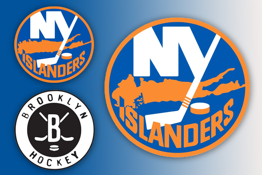
That logo, which shows a hockey stick and a puck and a map of Long Island, does not include all of Long Island. It cuts off Brooklyn.
When this map was created in 1972, the person who designed it took into account the fact the western 10% of the island is technically a borough of New York City and not a part of Long Island. Lots of advertising logos, when they include a map of Long Island, cut off Brooklyn. It’s true that geographically, the map of Long Island looks like a fish. But from a commercial and political point of view “Long Island” looks like a fish with its head cut off.
In 1898, the City of Brooklyn, which with 1 million inhabitants was the biggest city on Long Island, ceased being a city and allowed itself to be swallowed up by the bigger city next door. When that happened, New York City’s population suddenly exceeded three and a half million. New York became, at the time, after London, the most populous city in the world. Meanwhile, “Long Island” was now without a major city. With Brooklyn gone, it was just a bunch of small towns, a forlorn dead fish without a head. Nevertheless, we were all still very proud to be Long Islanders.
So that’s why, on the shirts of the New York Islanders hockey team, they had a hockey stick, a puck and a map without a head. But then this team became legendary. During the early 1980s, the Islanders won four Stanley Cups in a row. The Stanley Cup is to hockey like the World Series is to baseball. The Islanders now were a dynasty, dominating their sport like the New York Yankees dominated theirs. Barclays would be foolish to change the logo.
On the other hand, keeping this logo presents a bigger problem. Barclays Center is in Brooklyn. There is no Brooklyn in the logos on the shirts of the Islanders. I can’t think of any professional sports team that features a map on its logo that consists of everywhere else other than where the team plays its games.
One wonders if Barclays will make some kind of minor change with the logo to bring in Brooklyn. It would be easy to do. Just attach Brooklyn and shrink the map 20%. That would do it. I Googled the New York Islanders logo to see how this might look, and I came to a page that shows all the Islanders logos ever done, including logos proposed and logos never used. I also saw the current logo rejiggered. In one, which is not yet being used, they’ve kept the same map at the same size, but where the head is cut off, they’ve shaped Brooklyn in. But it’s a hatchet job. And where it ends on the western end, Great Neck, Mineola and Woodmere are gone, and in their place is the shape of Brooklyn Heights and Greenpoint and Coney Island. The Island looks whole, but fat and somewhat foreshortened. (Don’t read what comes next if you’re squeamish.) It’s similar to carving a face on the cut-off part of a fish that’s already cut in half. I can’t imagine a hockey player agreeing to go out and play in that.
What to do?
Well, you can look at images of Islanders logos, past and present, used and unused. Just Google “New York Islanders Logos.” Look at the image results. You’ll see one of their secondary logos there that shows the Montauk Lighthouse with a ship’s anchor at the bottom, sort of like a weird rocking horse.
As for the circle with the map and hockey stick, it remained as the Islanders’ logo, all through the glory days, until, in 1995, someone got the really stupid idea to scrap it. In its place, the New York Islanders management created a logo that featured an elderly Long Island fisherman with a big white beard wearing foul weather gear, a rubber hat, a rain coat and waders, holding a hockey stick and trying to play hockey. He had a determined look on his face. But nobody can play very well in foul weather gear.
During the two years this logo was in place, fans of other teams, such as the New York Rangers or the Philadelphia Flyers, would chant “we want fish sticks” at the Islanders team, because of its logo’s resemblance to the Gorton’s Fisherman logo on the boxes of frozen fish sticks you could get at the supermarket. After the two seasons, it was back to the famous logo of the map of Long Island.
Another logo for the Islanders features a new and imaginative replacement for the map. It’s a logo featuring a glamorous three-quarter view of the Brooklyn Bridge, the bridge that gave the Brooklyn millionaires at the end of the 19th century the idea of joining up with Manhattan.
So there you have it. The Islanders, from the never-used Montauk Lighthouse logo to the “Long Island” fish without a head, to the clammer fisherman in gear befitting Great South Bay, to the Brooklyn Bridge.
Go west, young man and make your fortune. The only thing that is going to save this situation is for Brooklyn to secede from New York City, declare itself the capital city of Long Island, make Long Island the 51st state, reduce the Islanders logo by 20% and there it will be, a hockey team all correct and up-to-date. A team of our own.
Vetted Hamptons Resources