Dan's Papers Cover Artist Mike Stanko Paints the Fun Life

Artist Mike Stanko would like to remind us all that “life is for fun”—a phrase he enjoys so much, it’s sort of become his motto. His work—full to the edges with vibrant colors which almost jump straight off the canvas—has been exhibited and collected both locally and nationally and has been featured on book and CD covers, diner menus and, of course, magazine covers. We talked with Stanko recently and hope the fruits of the conversation will be fun for you.

It says on your website your style is “New American.” Could you briefly explain what defines that style?
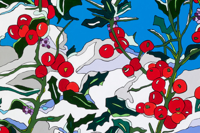
“New American” was a term used to describe my work years ago that stuck. It seems that since many of my images are very “Americana,” very Long Island, and are very familiar for anyone who grew up here on the island—whether it’s my painting of the Montauk Lighthouse, The Clam Bar, a grilled cheese sandwich or a pair of Keds sneakers—many people can relate to it. The “New” comes into it because of my use of bright vibrant “Pop” colors outlined in black.
You have had paintings at the Empire State Building and Snapple headquarters. Is there one place you’re most proud of having a painting?
As a Long Islander, having my painting of the North Fork’s Modern Snack Bar on the cover of this paper a few years back truly made me proud. But also being accepted into the Elaine Benson Gallery, by Elaine herself and [her daughter] Kimberly Goff definitely gave me that Sally Field “They like me!” moment. I was very proud.
Is there one place you want to have one of your paintings, but don’t yet?
Yes, MOMA—for obvious reasons.
If you could “redo” any classic painting in your own style, what would it be?
I actually have. Monet’s Le Bassin Aux Nymphéas (Water Lily Pond, 1919), which I love. But Van Gogh’s “Café Terrace at Night” is a painting I have always wanted to re-create, especially after my wife Karen and I made a pilgrimage there a few years back. To actually be there and then visit Vincent and Theo’s graves was tremendous. Thanks for bring this up. It just might now be my next work.
You have also designed some book jackets. What book jacket would you love to design?
Hmmm. The Art of Stanko’s America.
What’s your favorite color? Why?
Yellow has always been my favorite—and, as a Beatles fan, I know it was also George’s. But I can honestly say that my favorite colors can change. One working period it will be blue, during another, shades of green. I think it depends on my mood. Or maybe I actually just like them all. One observer once told me I was in a “Blue Period” because at one showing I seemed to have subconsciously used it to an excess. I didn’t notice until it was mentioned.
What color do you use most?
Because I paint so many landscapes and gardens, I pretty much use all colors. So any one of them can get a starring role. I also never mix my paint, I paint right from the tube. Hence my being dubbed “The Tubist.”
What color do you wish you used more of?
I paint so often, and use so many colors, I actually cannot think of one. Okay, maybe orange. It’s so vibrant. Now that you asked!


