Tips for a Creating a Well-Designed Zoom Room

Raise your hand if you have had a Zoom meeting in the last two months, whether for a fun family gathering or a work conference. As Zoom becomes more and more important and used in our everyday lives, you may find yourself asking various questions, including where in your home you should Zoom and what you should put in your background. Interior designer Allegra Dioguardi, owner of Styled and Sold, offers interesting insights and tips for making a great, personalized Zoom room.
We are all trying to adjust to the new normal but Zoom meetings, FaceTime and live streaming are likely here to stay indefinitely. Whether it’s a FaceTime happy hour with friends or a Zoom business meeting, we cannot deny the convenience of communicating virtually. While it is true that there are virtual backgrounds available, I prefer creating a pleasant, personal space in my home that reflects who I am.
-When you Zoom, you are essentially inviting people into your personal space. Think about how you want to represent yourself. If this is a business meeting, how do you want to represent your brand? Put your best face forward!
-Lighting is critical. Natural light is best if possible. The light source should be in front of you or to the side rather than behind you. Too much light will wash out your facial features, and too little light will obscure them or cast shadows. I do a preview before the actual event as a trial run prior to any formal or important Zoom meetings so I can adjust the lighting as necessary. For the most attractive and balanced lighting consider purchasing a ring light, easily found on Amazon, that is what the “pros” are using.
-I have found that raising my camera level (on a stack of books) is more flattering and natural, as opposed to having the camera look up at you.
-I prefer a background that is not too busy or distracting. Ideally, you want a background that lends itself to participants being able to focus on you.
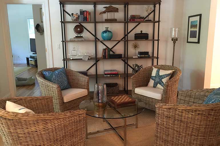
-One of the most popular and effective backgrounds I’ve seen used repeatedly is a bookcase. Books are understated yet visually appealing. Bookcases don’t need to be filled with only books. Intersperse the books with decorative items and accessories that reflect your interests. They also don’t need to be completely filled as negative space will create depth of field. I also like bookcases for their symmetry. Keeping your background balanced is a nice approach.
-Fresh flowers and live plants will infuse instant life into a Zoom background.
-Be wary of reflective surfaces such as a glass table or a mirror which could cause glare.
-Many of the same principles apply when creating a pleasing Zoom background that apply when creating beautiful interior design: Balance, simplicity, focal points, “less is more,” attractive colors combinations and the use of texture are some of my go-to design fundamentals!’


